Monday, 23 May 2011
The Usual Suspects: Haiku #5

Citizen Kane: Haiku #4

The Planet Of The Apes: Haiku #3

Memento: Haiku #2

The Matrix Revolutions: A Haiku
Wednesday, 27 April 2011
Just Something I Noticed #1
Tuesday, 4 January 2011
Musings on A Single Man

Last year saw the release of Tom Ford’s debut feature, A Single Man (2009). Directed and co-written by Ford, previously known for his work as a fashion designer, some reviewers were keen to describe the film’s visual focus as little more than an outer covering – a well-cut suit worn by an otherwise unremarkable man. Writing for online publication, Trespass Magazine, Glenn Dunks argued that, although A Single Man may “look perfect”, Ford’s tendency for “preening, polishing and enhancing” means that it “resembles an excessively over-designed photo shoot rather than a film.” An easy claim to make, it is a harder one to support, seemingly having been employed solely to draw cynical comparison with the director’s previous endeavours. No doubt if Ford had been best renowned as a restaurateur reviews would have included wordplays about whether his work had enough ‘flavour’ to live up to its immaculate presentation.
In actuality, A Single Man’s aesthetics are far from vacuous. Using visual cues to represent the heightened senses of a suicidal man, Ford allows his film’s imagery to reinforce thematic content. Convinced that he’s spending his last day on Earth, college lecturer George Falconer (Colin Firth) – the eponymous single man – is beginning to see the world differently and it is through this altered perspective that we witness events unfold. The effect is immediately apparent. With the majority of the film dominated by brown and white – the sets, costumes and camerawork ensuring that George’s life is devoid of any real colour – one could assume that Ford is simply staying true to the story’s early 1960s setting. Yet even Firth’s face is made-up to be remarkably pale, a choice that, paired with his dark suit and white shirt, allows George to merge with his surroundings. Whilst this wan complexion could be seen as indicative of George’s anxiety regarding his imminent suicide attempt, it also serves to reinforce his view of how insubstantial his life seems without the company of his recently deceased lover (Matthew Goode). George’s sinking into the background is not simply a display of Ford’s finesse, but an illustration of the character’s worst fear.
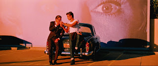
Using this as a visual base, Ford allows sparse instances of colour to elevate otherwise everyday occurrences, emphasising their effect on George’s fragile state. One example of this comes through the film’s repeated close-ups of eyes. Usually adding a striking flash of green or blue to a given scene, they appear most commonly when George is acknowledging another character’s positive traits; “You always look beautiful. Really beautiful”, he tells his secretary on one occasion. Denoting the moments where George feels a rare emotional connection to the world, this focus on eyes again occurs in a scene where he accepts a cigarette from a handsome Spanish stranger. Reluctant at first, it is making eye contact with the man that encourages George to embrace the opportunity. As the pair smoke together, gazing toward a bright sunset, George’s normally drained face becomes illuminated in red. There is a sense during this – the film’s most uncharacteristically colourful moment – that George is experiencing true happiness for the first time since losing his partner. A superb blend of imagery and theme, these scenes demonstrate that Ford’s knowledge of style extends well beyond the realms of fashion.


